The Anatomy of an Ad Headline

Writing less is harder than writing more.
At Giant Voices, we believe in creative driven by strategy. The most important metric for an ad, brochure, tweet or outrageous guerrilla stunt is not oohs or wows or industry awards—it’s client results.
That’s why every single word in everything we produce for a client has strategy and sweat equity behind it.
Here’s a behind-the-scenes look at a strategic, effective headline. Taking care with every detail of creative is an example of how to communicate your brand effectively.

Creating a Strategic, Effective Headline
Goals of an ad headline
When creating an ad, you only have a handful of words—sometimes just two or three!—to:
- Seize and keep a death-grip on the reader’s attention
- Maintain the brand personality
- Stay consistent with the larger strategic marketing campaign
- Avoid cliches
- Work with the art
- Speak to your ideal target market
- Persuade the reader to take a certain action
Basically, if you’re doing them right, headlines are the copywriting equivalent of one of those cooking reality shows where wannabe celebrity chefs have to conjure a five-star dinner out of yak fillets, pineapple rings, and a crocus.
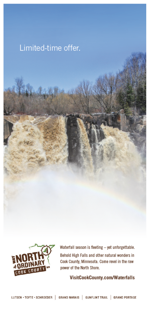
Example of strategic ad headline writing

The strategic goals that drove this specific headline
- Maintain consistency with established brand characteristics, among them brief, serious-sounding headlines with subtly surprising double meanings
- Position spring waterfalls as an attraction
- Frame their fleetingness as a feature, not a bug
- Intrigue viewers enough to get them to read the body copy (and click the ad)
- Distinguish this ad from other destination ads.
Why this headline works
Our Creative Giants came up with dozens—literally—of possible headlines until they arrived at this one. Let’s examine why this works:
- Positioning (copy must work hand-in-glove with art, which is the proverbial whole ‘nother conversation)
- Brevity invites engagement (because it’s so short, reading it requires only a small commitment of time and attention)
- Conveys value
- Conveys urgency
- Consistent with past ad format
- Familiar phrase rendered in a sleek, restrained type and paired with an unexpected image creates curiosity
- Double meaning creates a little burst of pleasure when it “clicks” in the reader’s mind
When you’re next creating an ad headline for your brand, take these notes into account to find the right messaging that both delivers results and meets your expectations.